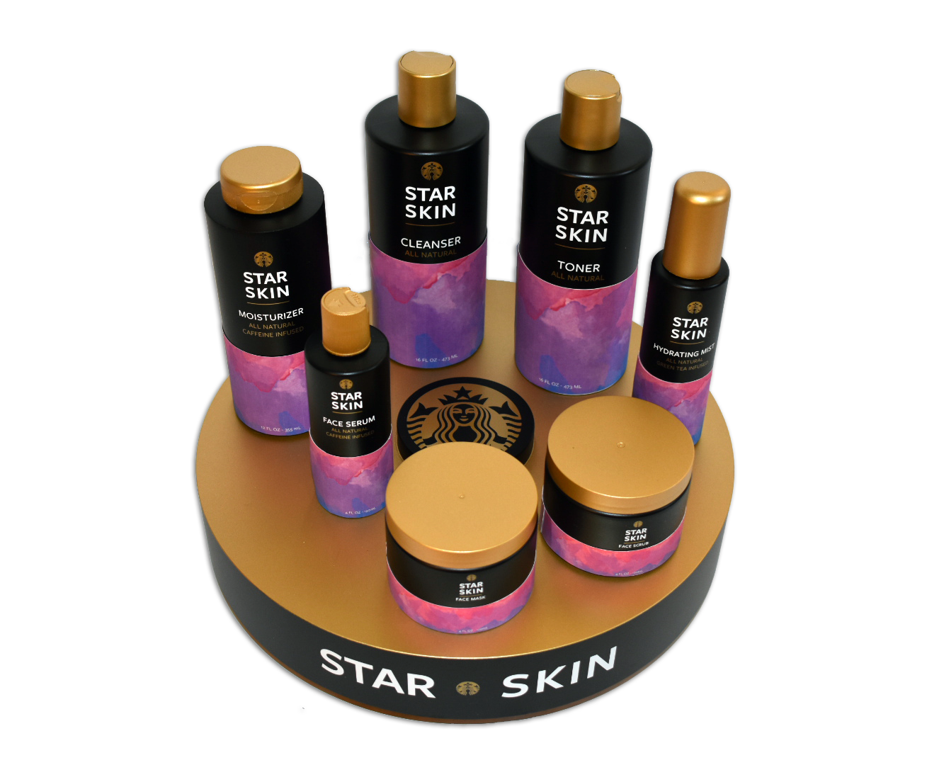
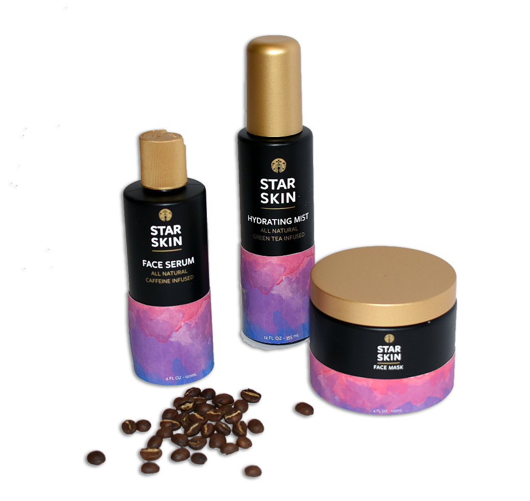
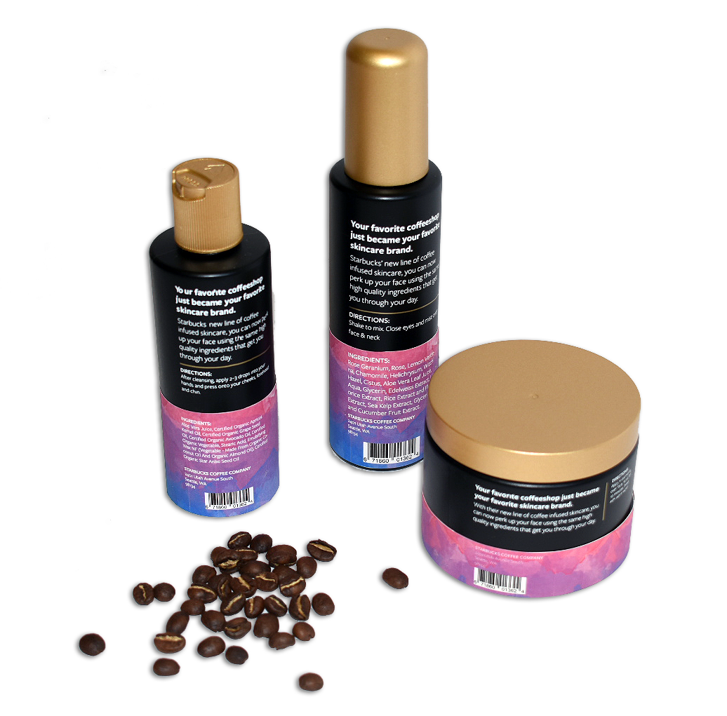
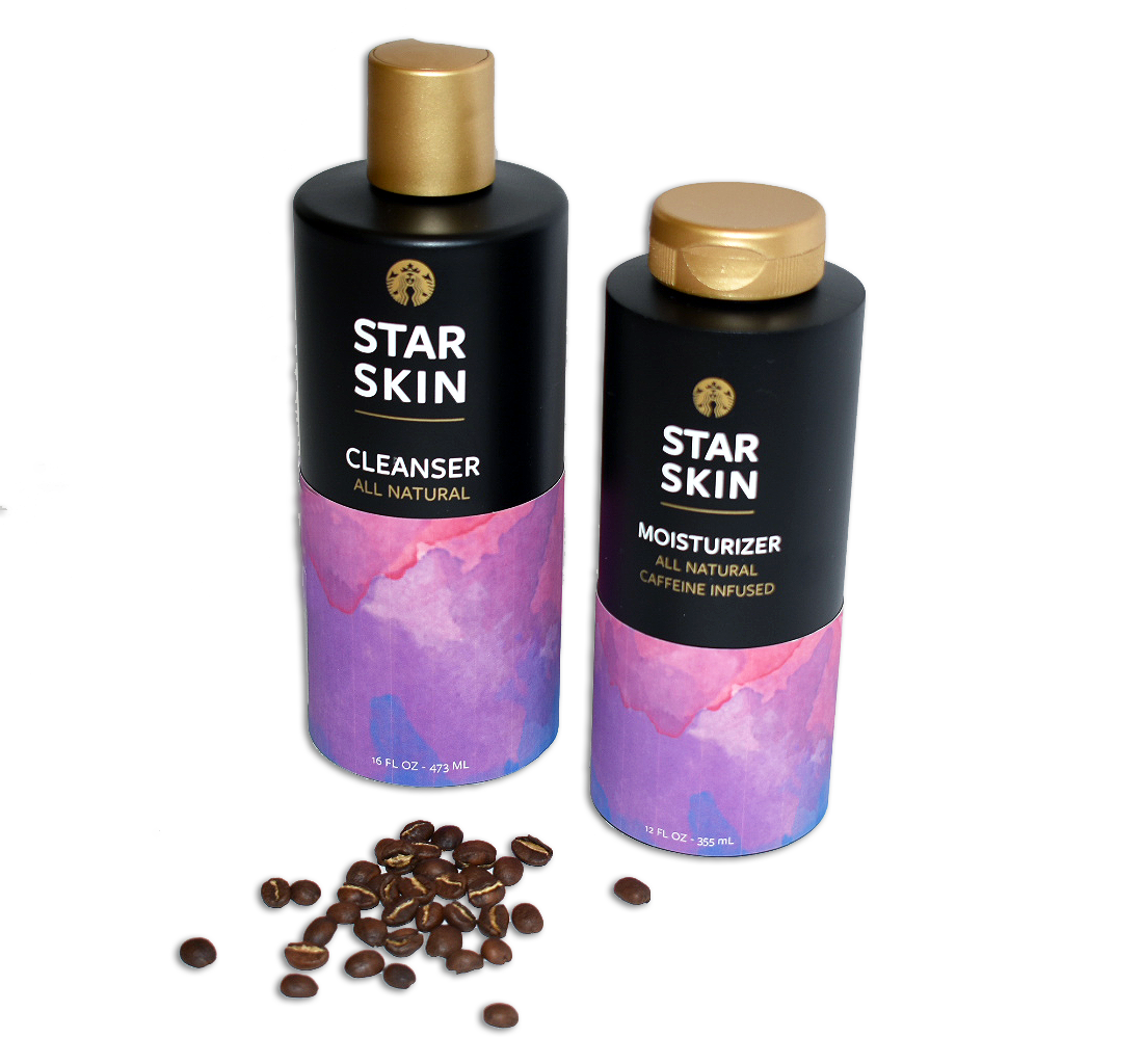
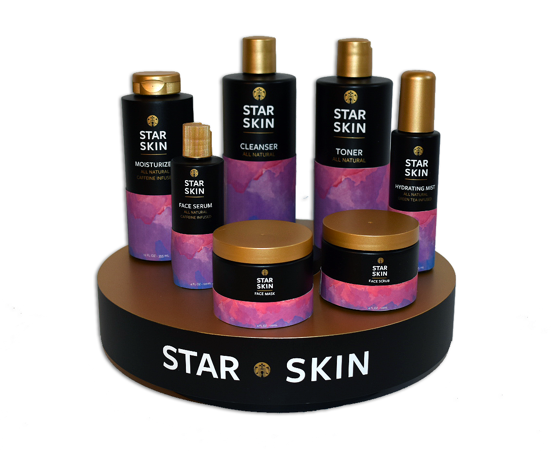
The first brand that came to mind was Starbucks Coffee. Not only is it one of the most well known brands in the world, but their packaging is always both stylish and eclectic. I knew I could draw inspiration from their many different lines of products to create something that would fit in amongst all the coffee & merchandise.
I visited several different Starbucks locations in order to determine what their current branding looked like, as they tend to change up their visual systems often. In the fall of 2018, there were a lot of dark colors, combined with jewel tones and bold patterns. I decided to create a combination of a watercolor pattern, with a black background, and gold accents.
